
Custom Softplay Colour Guide for Every Space
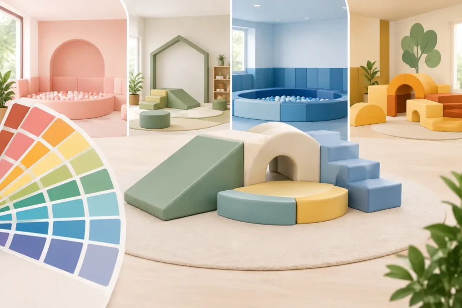
A well-planned play area does more than look good in photos. The right colours can make a compact lounge feel brighter, help nursery zones feel organised and give a commercial venue its own recognisable look. This custom softplay colour guide is designed to help parents, nurseries, schools and play centre operators choose a finish that works hard for their space, budget and daily use.
Colour is one of the biggest advantages of ordering bespoke soft play. You are not limited to a standard set that clashes with your flooring, walls or existing equipment. With factory-made options, you can build a ball pit, climbing set, safety pad or complete soft play area around the children using it and the room it needs to fit.
Start with the purpose of the play space
Before choosing a colour, decide what the area needs to achieve. A home setup may need to blend into a living room when playtime is over. A baby room may benefit from calm, gentle shades that do not overwhelm a young child. A nursery, school or commercial venue often needs clear zones that guide children from one activity to another.
Bright primary colours are still popular for good reason. Red, blue, yellow and green instantly say play, encourage a lively atmosphere and suit classic educational foam shape sets. They are particularly effective in larger rooms, where strong colour prevents a space from looking flat or unfinished.
That said, brighter is not always better. In a small room, too many bold colours can make the area feel busy. A more controlled palette, such as two main colours with one accent, often looks more considered and can make equipment feel like part of the room rather than an extra item squeezed into it.
Custom softplay colour guide: choose your palette
The most successful soft play colour schemes normally fall into one of four approaches. The best choice depends on who will use the equipment, how often it will be used and the impression you want visitors to take away.
Soft neutrals for homes and baby spaces
Grey, cream, beige, white and muted pastel tones are a strong choice for domestic soft play, sensory corners and baby-friendly rooms. They work particularly well with modern interiors and allow a ball pit or activity set to stay out without taking over the whole room.
Soft shades can still be playful. A pale grey and blush pink combination, sage and cream, or baby blue with white can feel warm and child-focused without looking overly loud. The trade-off is maintenance: very light colours may show marks sooner in high-traffic areas. If the equipment will be used daily by several children, consider adding darker base sections, edging or step surfaces where hands and feet are most likely to make contact.
Bright classics for active play
For busy, energetic play, primary and high-contrast colours remain a reliable choice. Blue and yellow, red and blue, or a full multicolour set can make climbing shapes, tunnels, wedges and step-and-slide units feel immediately inviting.
This option suits playgroups, preschool rooms and venues that want a traditional soft play look. It is also practical when equipment is spread across a larger space, because colour helps individual pieces stand out. Use repeated colours across different units to tie the room together rather than selecting every shade available.
Modern two-tone schemes for commercial venues
For commercial soft play areas, a two-tone or three-tone scheme usually delivers the strongest result. Navy and grey, black and yellow, teal and lime, or purple and grey can look sharp while giving a venue a clear identity.
Dark colours are useful around ball pits, entrance areas and high-contact equipment because they can be more forgiving between cleans. Brighter accent colours can then be used on slides, blocks, balance beams or feature walls to retain the excitement children expect. This creates a polished look without sacrificing the fun factor.
Branded colours for schools and businesses
If your nursery, school, community group or play centre already has established colours, bespoke soft play can become part of your visual identity. Matching key colours across mats, foam shapes, wall protection and seating can make a room feel purpose-built.
Exact matching can depend on the material and colour availability, so it is sensible to discuss your requirements before ordering. In many cases, a close practical match delivers a better result than chasing a shade that may not wear as consistently over time. The goal is a professional space children enjoy using, not a colour chart exercise.
Use colour to organise the room
Custom colours are not only decorative. They can help children, staff and parents understand how a space is meant to work.
In a nursery or larger commercial setting, use one colour family for active climbing equipment and another for quieter areas such as baby mats, reading corners or sensory play. A contrasting strip around the edge of a safety mat can also make boundaries easier to see. This is especially useful where younger children and older children share a room at different times.
For home users, colour zoning can be simpler. A neutral play mat with a colourful ball pit creates a clear play focus without changing the feel of the whole room. If storage is nearby, choosing matching colours for soft blocks and foldable mats helps the area look tidy once everything is packed away.
Consider cleaning, wear and real-life use
A custom design should look good on day one and still make sense months later. Think honestly about footfall, snacks, shoes, pets and how often the equipment will be moved. A pristine white ball pit may suit a carefully supervised home playroom, while a nursery with multiple sessions each day may be better served by mid-tone or darker side panels.
Vinyl soft play surfaces are designed to be wiped clean, but colour choice can make routine care easier. Mid-greys, blues, greens and darker purples tend to be practical choices for frequently handled pieces. Lighter colours work well as highlights, on low-use panels or in areas where the clean, airy appearance matters most.
Also consider ball pit balls. A mixed ball colour selection can disguise the occasional misplaced ball and creates a lively finish, while a tightly controlled palette looks more premium and fits a branded room. For example, white, grey and clear-style tones can suit a contemporary home setup, whereas blue, yellow and red give a traditional commercial play feel.
Make the size and colour work together
Large equipment can carry stronger colours than small equipment. A spacious commercial room may cope easily with a bold red-and-blue climbing frame, whereas the same combination could dominate a small flat or narrow nursery corner. If space is limited, choose a calmer main colour and let smaller elements provide the contrast.
Custom sizing gives you even more control. A made-to-measure mat can follow the shape of a room, while a bespoke ball pit can be built to suit an available corner. Once dimensions are planned properly, choosing colours becomes easier because you can see which areas deserve to stand out and which should sit quietly in the background.
At Softplay Toys4Kids, bespoke production means customers can discuss colours alongside dimensions, equipment types and intended use. That matters because a great-looking design that does not suit your room or daily routine is not good value, however low the price may be.
Avoid common colour mistakes
The first mistake is choosing from a screen without considering the room lighting. Daylight, warm ceiling lights and coloured walls can all change how a shade appears. If you are planning a larger order, take a moment to assess the space at the time it is normally used.
The second is adding too many colours. Children do not need every item to be a different shade for a room to feel exciting. A consistent palette looks more professional, is easier to add to later and gives feature pieces more impact.
Finally, do not choose colour separately from safety and layout. Leave sensible clearance around climbing equipment, select the right protective mats and make sure the equipment is suitable for the age group using it. The finish should support a safe, stimulating play environment, never distract from it.
The right palette is the one that suits your children, your room and the way the equipment will be used every day. Choose colours you will be happy to see after the excitement of delivery day, then build a soft play space that feels made for you.
Leave a Reply