
How to Choose Sensory Room Colours: A Practical Design Guide
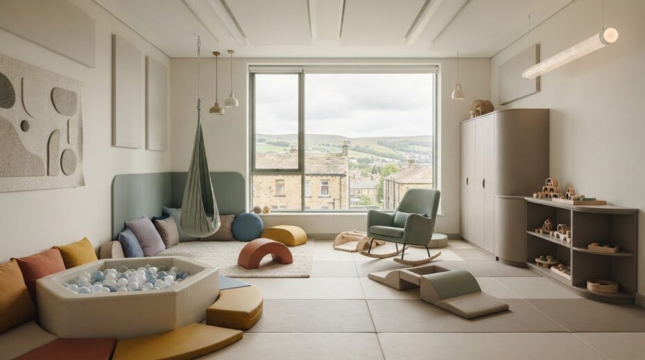
What if the vibrant primary colours you’ve picked for your child’s sanctuary are actually the secret trigger for their next meltdown? It’s a worrying thought for any parent or educator, especially when you’re trying to figure out how to choose sensory room colours that actually work. You likely feel the pressure to get it right the first time, stuck between “fun” bright tones and the fear of causing sensory overload. We know you want a professional-looking space that fits your home or school while providing the ultimate support for self-regulation.
Selecting the right palette doesn’t have to be a guessing game that risks your budget. This guide shares the science-backed secrets to selecting a perfect palette that balances active stimulation with calming relaxation. We’ll dive into the latest UK design standards, including PAS 6463:2022, and explain how to pair your wall tones with durable, West Yorkshire-made soft play mats and ball pits. You’ll gain the confidence to invest in a space that truly supports child development, ensuring every pound spent creates a high-quality environment where your child can thrive.
Key Takeaways
- Learn the “Sensory Volume” concept to understand how specific hues can either dial up arousal or create a peaceful sanctuary for your child.
- Master how to choose sensory room colours by identifying your space’s primary goal, whether it’s for burning off energy or winding down.
- Discover how to use the zoning technique and evaluate natural light to prevent visual noise that often leads to sensory overload.
- See how to use neutral walls as a canvas for high-quality, handmade equipment like ball pits and play mats that provide the perfect pop of functional colour.
- Gain the confidence to invest in bespoke, UK-manufactured soft play solutions that meet strict safety standards while fitting perfectly into your home.
Understanding the Impact of Colour on Sensory Processing
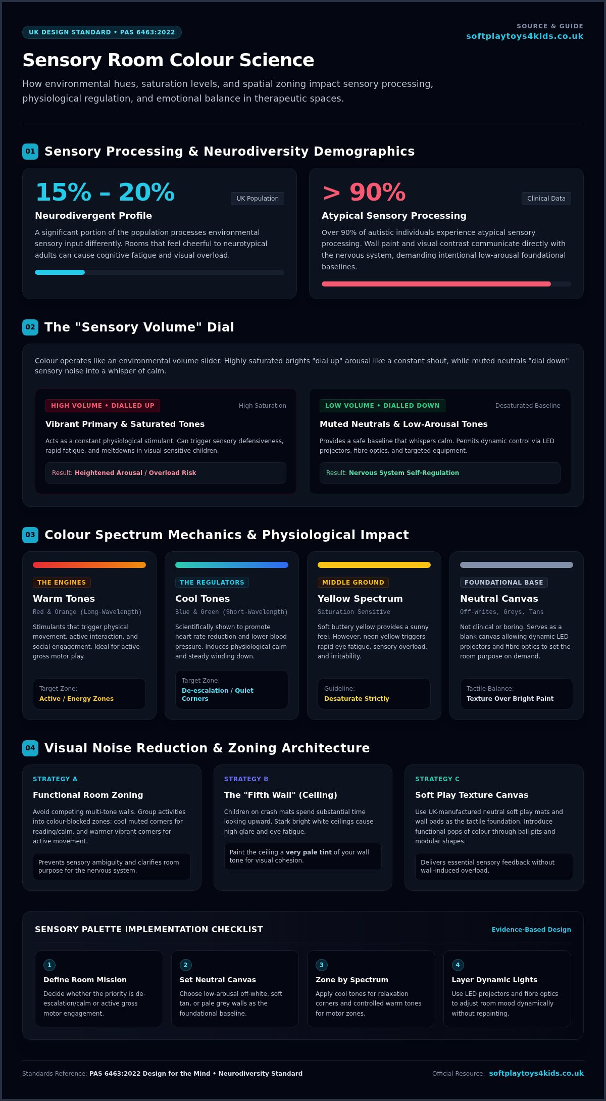
Colour isn’t just a decorative choice; it’s a direct line of communication to the brain. Every hue we see translates into emotional and physiological signals that can either soothe or agitate. In therapeutic sensory rooms, this relationship is vital. We call this the “Sensory Volume” concept. Think of bright, highly saturated colours as turning the volume up on the environment. For a child who is already hypersensitive, this can feel like a constant shout. Conversely, muted, neutral tones turn the volume down, providing a much-needed whisper of calm. When you are learning how to choose sensory room colours, you’re essentially learning how to tune the room to your child’s nervous system.
This is especially critical for neurodivergent children. Statistics suggest that 15% to 20% of the UK population has a neurodivergent profile, and over 90% of autistic individuals experience atypical sensory processing. A room that feels “cheerful” to a neurotypical adult might be physically painful for a child with visual sensitivities. By establishing a “foundational palette” of low-arousal tones, you create a safe baseline. This allows you to introduce specific sensory toys and equipment that provide targeted stimulation without the walls themselves contributing to sensory overload.
The Psychology of Warm vs. Cool Tones
Red and orange are the “engines” of the colour world. These long-wavelength colours are stimulants that encourage movement, interaction, and social engagement. They’re perfect for active zones where you want to boost energy. Blue and green sit at the opposite end of the spectrum. These are the “regulators” that are scientifically shown to promote heart rate reduction and lower blood pressure. Yellow is frequently touted as a “happy” middle ground, but it requires careful saturation control. While a soft, buttery yellow can feel sunny, a neon yellow can quickly lead to eye fatigue and irritability. When considering how to choose sensory room colours, always lean toward the desaturated versions of these tones to keep the environment predictable.
Why “Neutral” Does Not Mean “Boring”
Many parents worry that off-whites, greys, or tans will look clinical. In reality, a neutral background is your best friend. It acts as a “blank canvas” that allows colour-changing LED projectors and fibre optics to define the room’s atmosphere dynamically. This prevents visual clutter and gives you the flexibility to change the room’s purpose instantly. At our West Yorkshire factory, we manufacture soft play mats and wall pads in various neutral vinyls. These provide essential tactile feedback and safety while maintaining a professional, calm aesthetic. By using texture instead of bright paint to create interest, you support your child’s development without the risk of overstimulation.
Choosing Colours Based on Room Purpose: Calming vs. Stimulating
Before you open a single tin of paint, you must ask: what is the end goal for this space? A room designed for de-escalation requires a completely different approach than one built for high-octane physical play. Understanding how to choose sensory room colours starts with defining this mission. Recent research on multi-sensory environments highlights that adjustable visual stimuli are key to emotional regulation. If the room’s purpose is unclear, the child’s nervous system won’t know whether to relax or engage, often leading to confusion and stress.
If you don’t have the luxury of separate rooms, use the “zoning” technique. This involves using different colours in specific corners to signal different activities. You might use a soft, cool corner for reading and a warmer, more vibrant area for movement. This reduces “visual noise,” which is the clutter created when too many high-contrast colours compete for attention. By colour blocking your zones, you provide clear transitions that help a child self-regulate as they move through the space. Our team at SoftplayToys4kids can even help you select vinyl colours for your mats that align perfectly with these functional zones.
Don’t ignore the “fifth wall.” Children spending time on crash mats often spend a significant amount of time looking upward. A stark, bright white ceiling can be incredibly draining and cause glare. Consider painting the ceiling a very pale version of your wall colour to keep the environment cohesive and gentle on the eyes.
The Calming Room (De-escalation)
For a sanctuary meant for winding down, stick to a palette of soft blues, sage greens, and muted lavenders. These colours are proven to lower heart rates and encourage deep breathing. Avoid high-contrast patterns or borders, as these can cause visual “vibrations” that are unsettling for hypersensitive individuals. Always use matte finishes for your walls and equipment. Shiny surfaces reflect light harshly, creating “hot spots” that can trigger migraines or sensory discomfort. Keep it simple, keep it soft, and keep it consistent.
The Interactive Room (Active Play)
When the goal is engagement, you can be bolder with how to choose sensory room colours. Vibrant teals and selective primary colours work well here to encourage movement. Use these bolder tones to define “action zones,” such as the area surrounding ball pits or climbing structures. Bright colours can act as visual cues, encouraging a child to reach, jump, and explore their physical limits. Just remember to balance these pops of energy with neutral flooring to prevent the room from becoming overwhelming.
A Step-by-Step Guide to Colour Selection
Creating a therapeutic environment requires a systematic approach to avoid expensive design mistakes. If you’re wondering how to choose sensory room colours that truly support your child’s needs, follow this simple five-step process. It starts with observation rather than a trip to the paint shop. Watch your child’s natural reactions to colours in their daily life. Do they gravitate toward the blue cushions or avoid the bright yellow toy box? These subtle cues are your most reliable blueprint.
Once you’ve identified their preferences, evaluate the natural light in your intended space. A room’s orientation changes how a colour “behaves” throughout the day. Next, select your “Hero” colour. This should be a muted, calming tone that covers the majority of the wall space. After that, choose two or three secondary “Accent” colours. These are perfect for your soft play items, such as ball pits or floor mats. Finally, always test your chosen palette with your specific sensory lighting. A bubble tube’s cycle or a fibre optic glow can drastically shift how a paint shade appears, sometimes turning a soft lilac into a distracting grey.
Evaluating Natural vs. Artificial Light
In the UK, north-facing rooms are notoriously tricky because they receive a weak, blue-toned light. This can make cool colours look “muddy” or cold, which isn’t ideal for a sanctuary. Conversely, south-facing rooms can be so bright that they cause a “washout” effect. This is where high-tech light projectors simply disappear against the wall because the base colour is too light or too reflective. We recommend testing paint swatches at night under your actual sensory lamps. This ensures the environment remains predictable and soothing when the sun goes down, preventing unexpected visual triggers.
Selecting Child-Safe and Durable Finishes
Design isn’t just about the look; it’s about the longevity and safety of the space. High-traffic sensory areas need wipe-clean surfaces that can handle everything from sticky hands to heavy impact. When painting, look for low-VOC (Volatile Organic Compounds) options. These are essential for protecting the air quality for children with sensitive respiratory systems or allergies. It’s also vital to coordinate your paint durability with your soft play equipment. At our West Yorkshire factory, we use premium, medical-grade vinyls that are designed to be both tough and easy to sanitise, ensuring your investment stays in top condition for years to come. Compare our handmade quality to mass-produced alternatives, and you’ll see why durability is the cornerstone of a successful sensory design.
Coordinating Colours with Equipment and Lighting
Once you’ve established your foundational wall tones, the real magic happens when you integrate your physical equipment. A common mistake is choosing bright walls and then adding equally vibrant equipment, which creates a chaotic environment that’s hard to navigate. Instead, use your soft play items as the functional “pop” of colour against a neutral backdrop. When you’re deciding how to choose sensory room colours, remember that your equipment should work with your walls, not compete with them. This approach allows the child to focus on the task at hand without being distracted by a visual “shout” from every direction.
The relationship between sensory toys and the surrounding environment is crucial for engagement. For example, using colour-coded mats can guide children through a “Sensory Circuit,” providing a clear visual path for specific movements like jumping, rolling, or crawling. Don’t forget that the floor is your most important “fifth wall.” In a soft play environment, children spend a vast amount of time at ground level. Choosing a floor colour that provides a calm, stable base is essential for emotional grounding and physical safety.
Matching Mats and Padding
For children with depth perception issues or visual processing differences, contrast is your best friend. Choosing mat colours that contrast clearly with the floor helps them identify where a surface begins and ends, reducing the risk of trips. Safety padding shouldn’t just be a utility; it’s a key design element. At our West Yorkshire factory, we offer bespoke padding in various shades, allowing you to create a cohesive look that supports your room’s purpose. For hyper-sensitive children, monochromatic equipment sets in muted tones can be a game changer, providing the necessary physical protection without the risk of overstimulation. Explore our range of custom-coloured safety pads and mats today.
Lighting: The Dynamic Colour Changer
Lighting is the ultimate tool for mastering how to choose sensory room colours because it allows for instant transformation. RGB lighting can turn a simple white room into any colour of the rainbow, giving you total control over the “sensory volume.” However, be mindful of the “After-Image” effect. If a child spends time staring at a bright bubble tube or fibre optic strand, they need a neutral recovery wall to look at afterward to prevent visual fatigue. You might also consider using glow-in-the-dark elements on mats or padding for specific visual tracking exercises in a darkened room, adding a layer of interactive fun to your therapeutic sessions.
Creating Your Dream Sensory Space with SoftplayToys4kids
Choosing the right palette is the first step, but bringing that vision to life requires equipment that matches your standards for safety and style. We aren’t just another corporate supplier; we are a proud, hands-on manufacturer based right here in Bradford, West Yorkshire. Our team understands that figuring out how to choose sensory room colours is a deeply personal process for parents and a critical one for schools. That’s why we offer a bespoke design service to help you plan your layout and colour scheme from the ground up, ensuring every element works in harmony.
Every item we produce, from our vibrant ball pits to our calming neutral play mats, is handmade with care. Because we manufacture everything in-house, we offer an incredible variety of vinyl colours. You aren’t limited to standard nursery primaries. You can select the exact shades of sage, slate, or soft biscuit that we discussed earlier to ensure your room remains a low-arousal sanctuary. Plus, buying direct from our West Yorkshire factory means you get premium quality and direct-from-manufacturer pricing without the middleman markups.
Custom Designs for Home and School
We work closely with schools and nurseries across the UK to create durable, multi-user spaces that meet strict safety regulations. Our equipment uses flame-retardant, phthalate-free PVC and high-density foam that complies with BS 5852 Ignition Source 5 (Crib 5) standards. For home sensory rooms, we can personalise ball pits and sets to fit smaller spaces perfectly. This flexibility ensures that whether you’re designing a professional de-escalation suite or a cosy corner in a bedroom, the quality remains commercial-grade and built to last. Compare our craftsmanship with mass-produced imports, and the difference in durability is clear.
Start Your Sensory Journey Today
Don’t let the fear of making the wrong choice hold you back from creating a life-changing space for your child. Any room, no matter the size or shape, can become a sanctuary with the right colours and high-quality padding. We invite you to browse our extensive range of sensory-friendly equipment and see the craftsmanship for yourself. Ready to turn your plan into reality? Contact our creative team today for a custom quote and let’s build a space where your child can truly thrive. Your investment in their development starts with a safe, beautifully designed environment that you can trust for years to come.
Transform Your Vision into a Therapeutic Sanctuary
Designing the perfect environment doesn’t have to be overwhelming when you understand the science of “Sensory Volume.” By prioritising neutral foundations and using equipment as functional pops of colour, you’ve mastered the essentials of how to choose sensory room colours. You now know that testing your palette under specific lighting is the secret to preventing sensory overload and ensuring long-term success for your child’s development.
At SoftplayToys4kids, we’re proud to be a trusted partner for UK schools and nurseries, providing handmade equipment straight from our West Yorkshire factory. We believe every child deserves a safe place to grow; that’s why we offer competitive direct-to-consumer pricing without compromising on premium durability. Don’t settle for mass-produced alternatives when you can have bespoke quality designed specifically for your needs. Our materials are safe, phthalate-free, and built to withstand years of therapeutic play.
Ready to build a space that truly makes a difference? Explore our range of sensory-ready soft play equipment and start your design today! Your child’s dream sanctuary is just a few clicks away, and we’re here to help you every step of the way with professional advice and handmade British quality.
Frequently Asked Questions
What is the most calming colour for a child with autism?
Soft blues, sage greens, and muted lavenders are widely considered the most calming. These cool tones help lower heart rates and promote relaxation. When deciding how to choose sensory room colours, avoid high-saturation shades that can feel overwhelming. Instead, look for desaturated, biophilic tones inspired by nature. Our handmade safety pads in these soothing vinyl shades provide a professional, calming finish that supports self-regulation for children with autism.
Should I avoid using bright red in a sensory room?
You don’t need to banish red entirely, but use it sparingly as a high-arousal stimulant. Bright red encourages movement and interaction, making it perfect for active play zones featuring ball pits or climbing wedges. However, it can trigger overstimulation in de-escalation spaces. Use it for specific interactive equipment rather than primary wall surfaces. This approach keeps the sensory volume manageable while still providing the energy needed for physical development and engagement.
Can I use multiple colours in a small sensory space?
Yes, you can use multiple colours by implementing a zoning strategy. In a small space, a single “hero” neutral tone keeps the room feeling open and calm. You can then use different coloured play mats or column padding to define specific areas, such as a blue corner for reading or a teal zone for active play. This colour-blocking technique prevents visual clutter and helps children transition between different sensory activities without feeling crowded.
How do I choose colours for a room used by multiple children with different needs?
The most effective way to accommodate different needs is to start with a neutral foundational palette. Off-white or pale grey walls act as a blank canvas. You can then use dynamic RGB lighting to shift the room’s colour instantly based on who is using it. Pair this with our bespoke, custom-coloured soft play equipment from our Bradford factory to create a versatile environment that can be tuned for both sensory seekers and avoiders.
Do sensory room colours affect mood and behaviour?
Absolutely. Colour functions as a physiological signal to the brain. Warm tones like orange can increase energy and heart rate, while cool tones promote a sense of security and calm. Understanding how to choose sensory room colours allows you to influence these emotional states directly. By selecting the right balance of wall paint and durable vinyl mats, you can create a predictable environment that actively helps a child manage their mood and behaviour.
Is it better to have dark walls or light walls for projectors?
Light, matte walls are generally superior for projector use. While some believe dark walls enhance contrast, they can also make a room feel claustrophobic or scary for some children. An off-white or very pale grey wall ensures that projections remain vivid without the washout effect of a gloss finish. For the best results, pair these light walls with dark-coloured soft play mats to ground the space and reduce floor-level glare.
What are the best colours for a sensory room ceiling?
Avoid stark, brilliant white, as it causes significant glare for children lying on crash mats or play mats. Instead, choose a very pale version of your wall colour or a soft, warm neutral. This “fifth wall” should feel gentle and non-reflective. A matte finish is essential here to prevent harsh hot spots from sensory lamps or bubble tubes, ensuring the entire environment remains cohesive and soothing from every angle.
How often should I update the colour scheme of a sensory room?
There is no fixed rule, but many schools and nurseries update their spaces every 3 to 5 years as children’s needs evolve. You don’t always need a full repaint; often, updating the accent colours through new sensory toys or fresh safety padding is enough. Because our equipment is handmade in West Yorkshire for commercial-grade durability, the physical items will last, giving you the flexibility to refresh the look without a total overhaul.
Leave a Reply